Gulyangarri Public School
Brand Identity System
A place to learn. A place to belong.
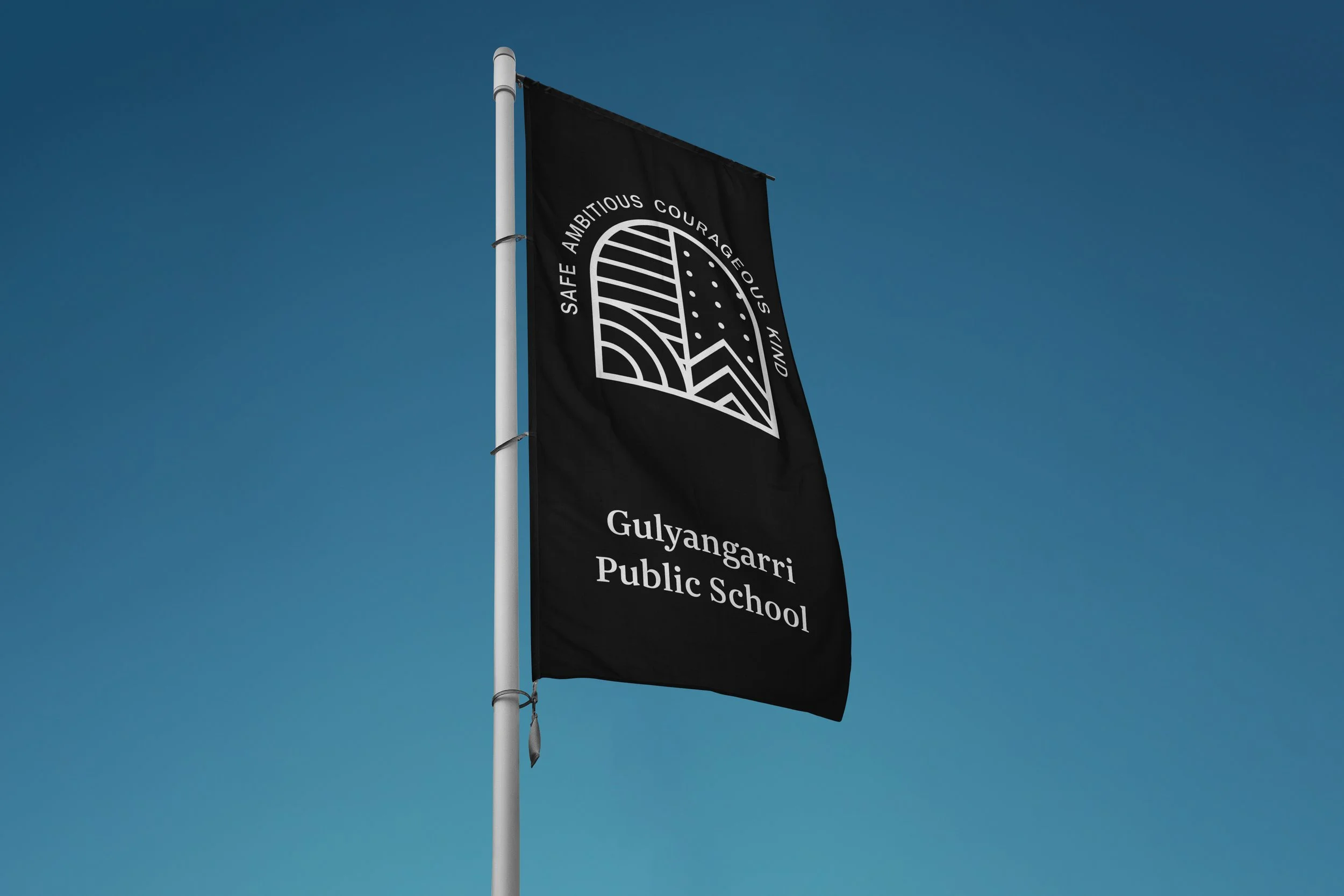
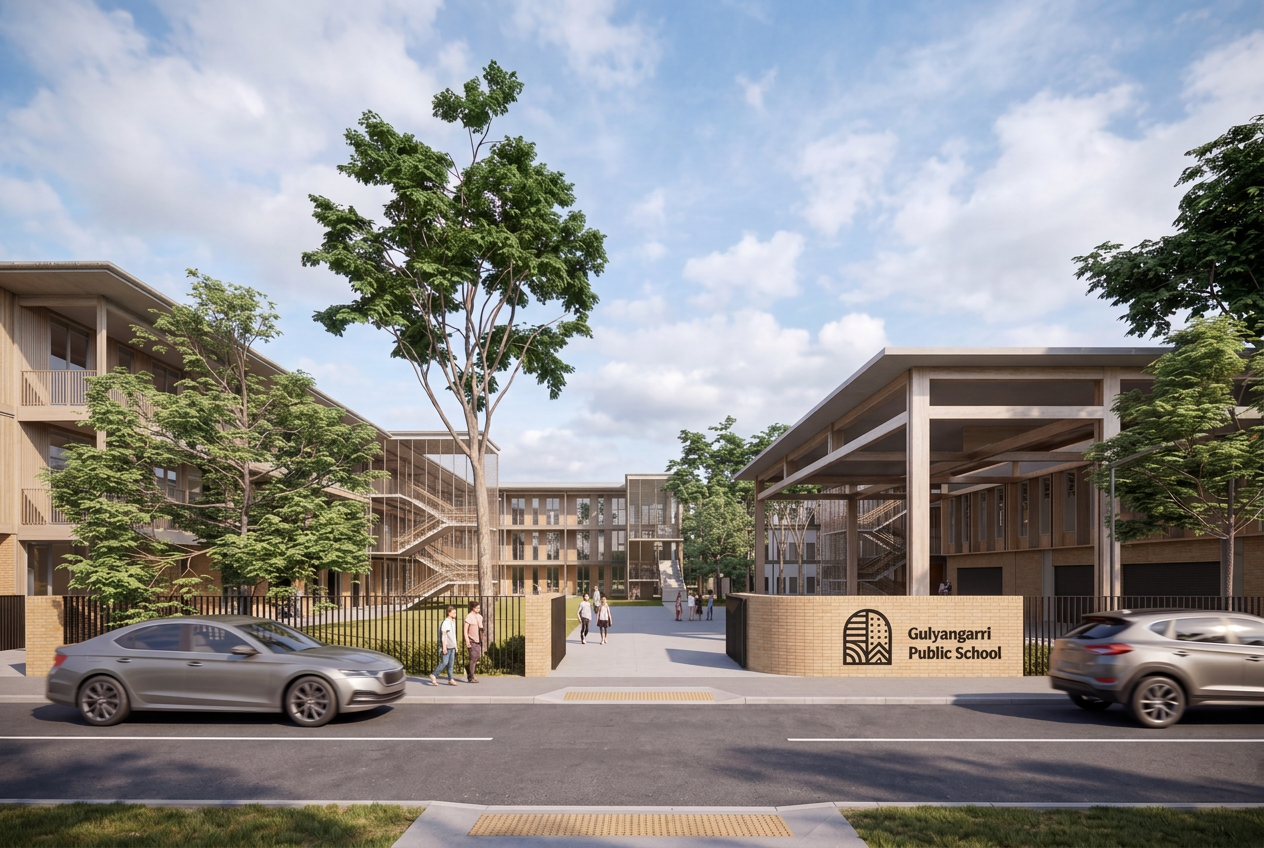
Gulyangarri means ‘children’ in the Dharug language. Created in collaboration with NGNY, the identity centres on this simple idea: a school shaped around its children with a sense of belonging at its heart.
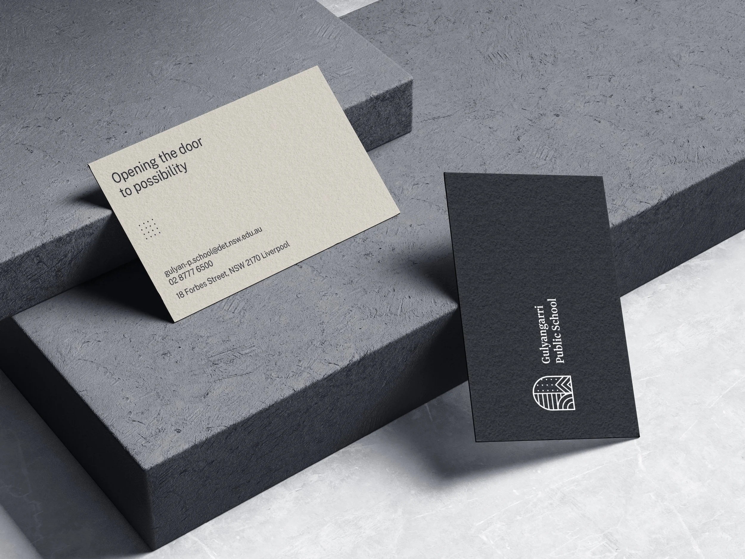
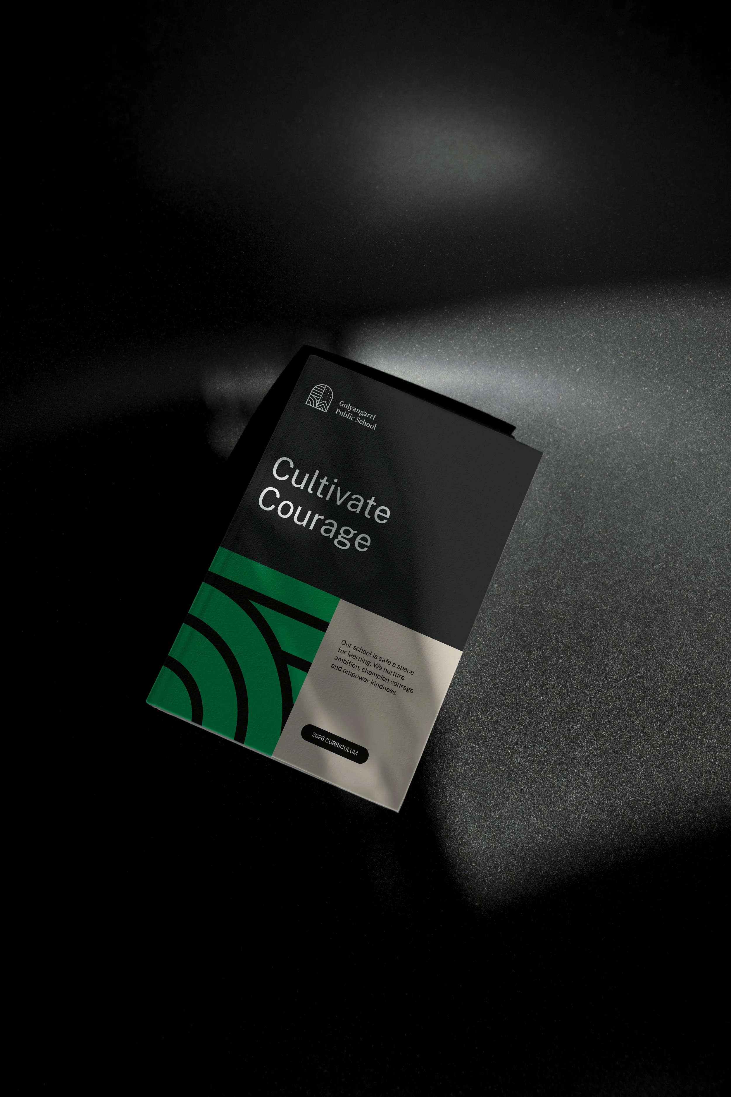
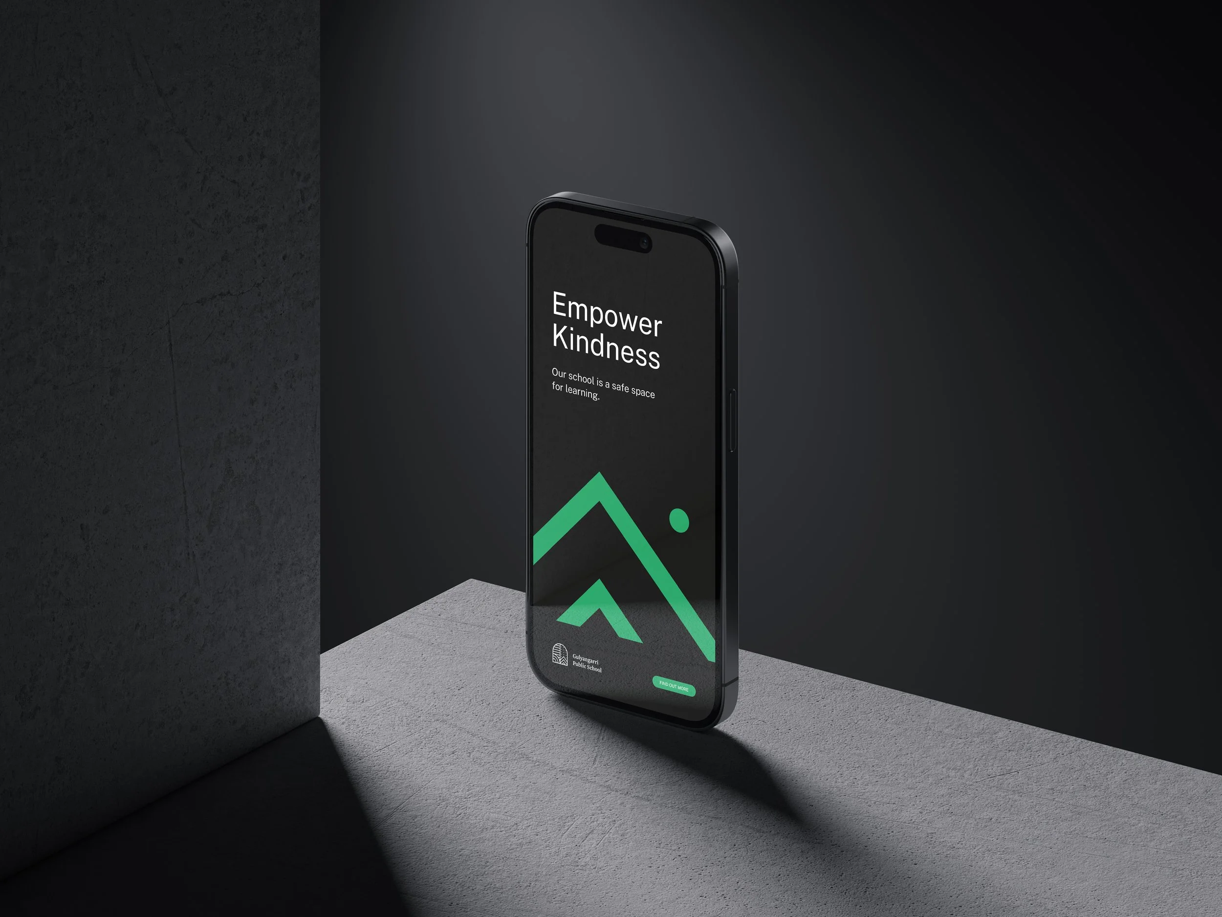
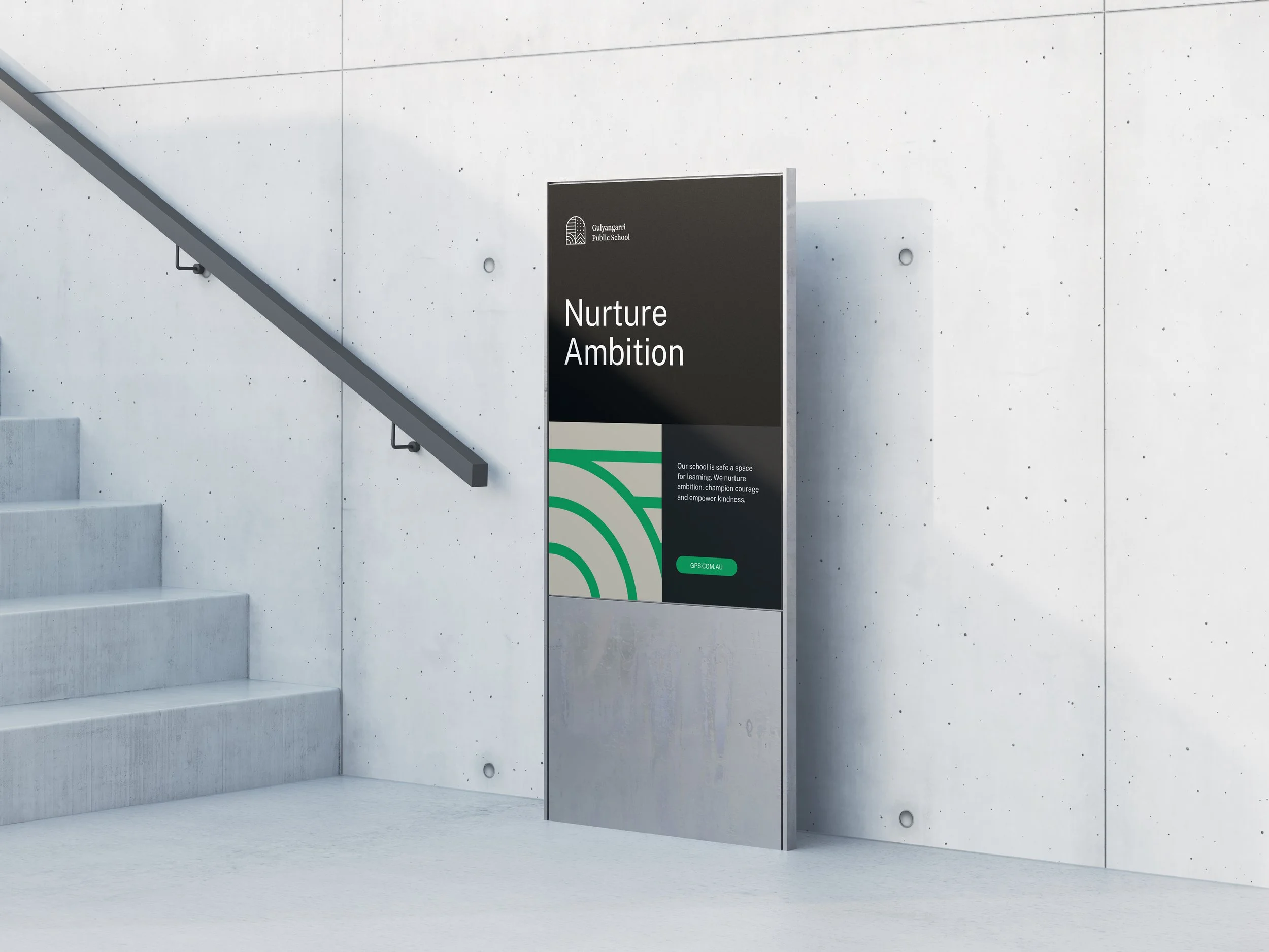
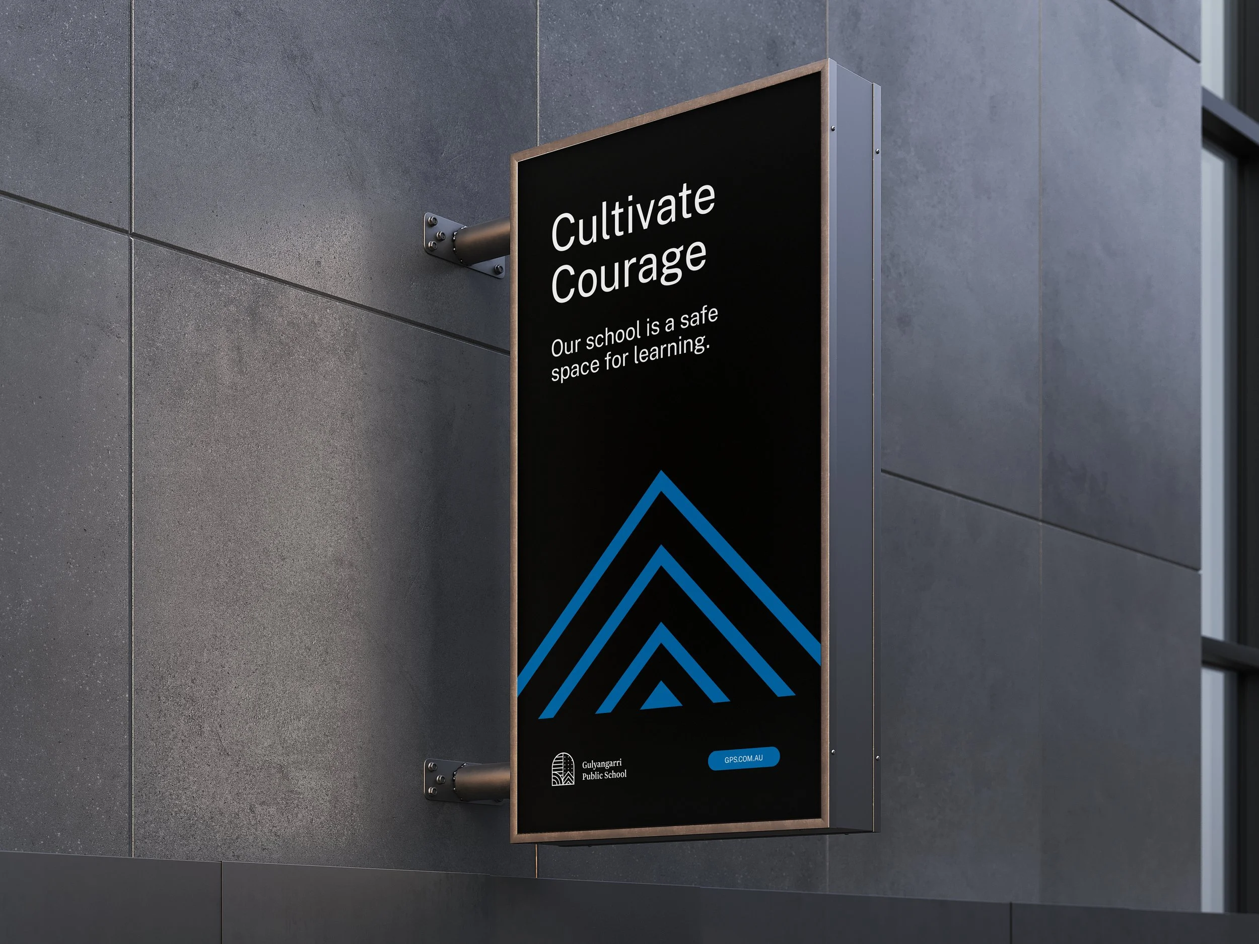
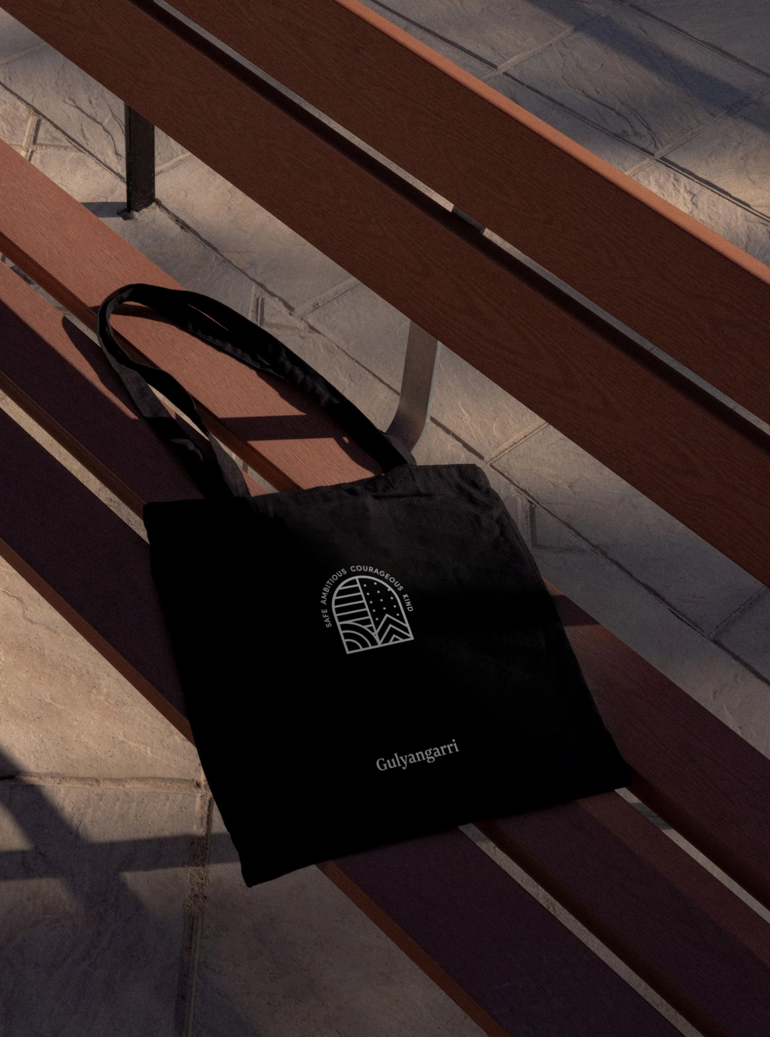
We approached the logo as a set of building blocks, giving form to the school’s values of safety, ambition, courage and kindness. Lines suggest pathways and protection. Arcs speak to ambition and connection. Upward forms carry courage, while repeating dots express community and the idea that kindness multiplies. Together, they sit within an open doorway - a welcoming symbol of learning and possibility.
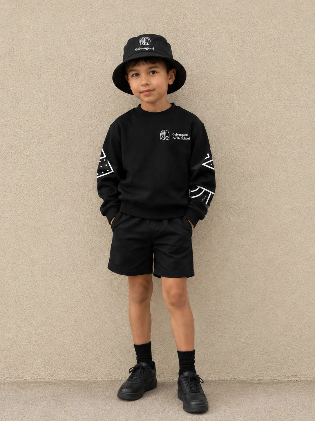
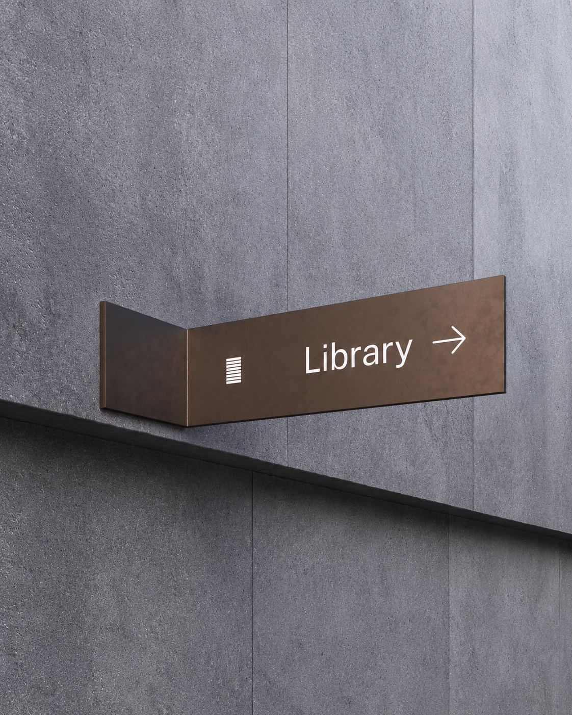
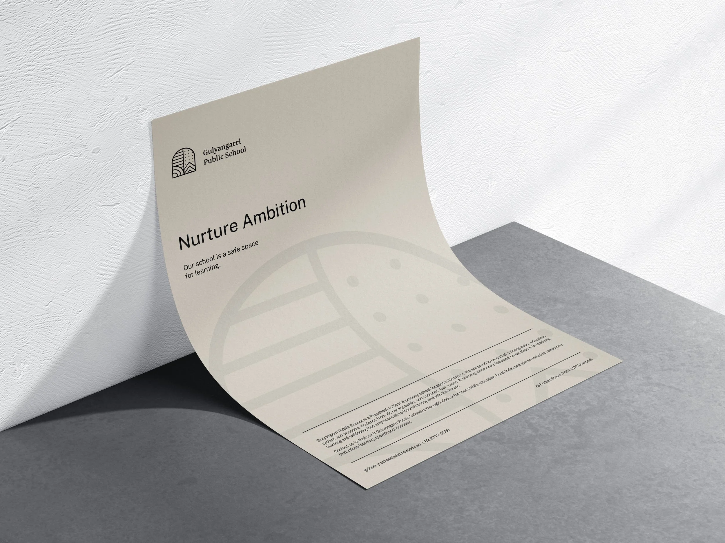
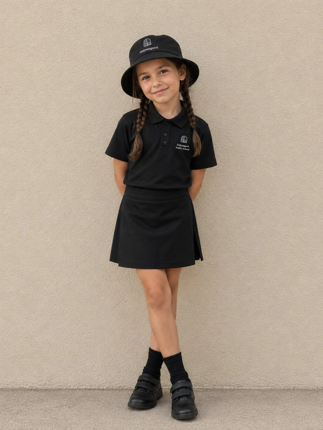
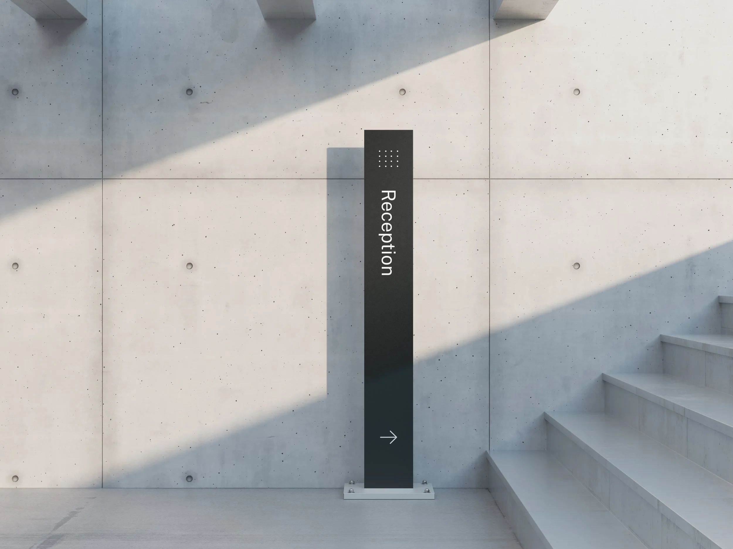
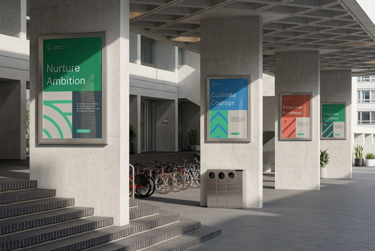
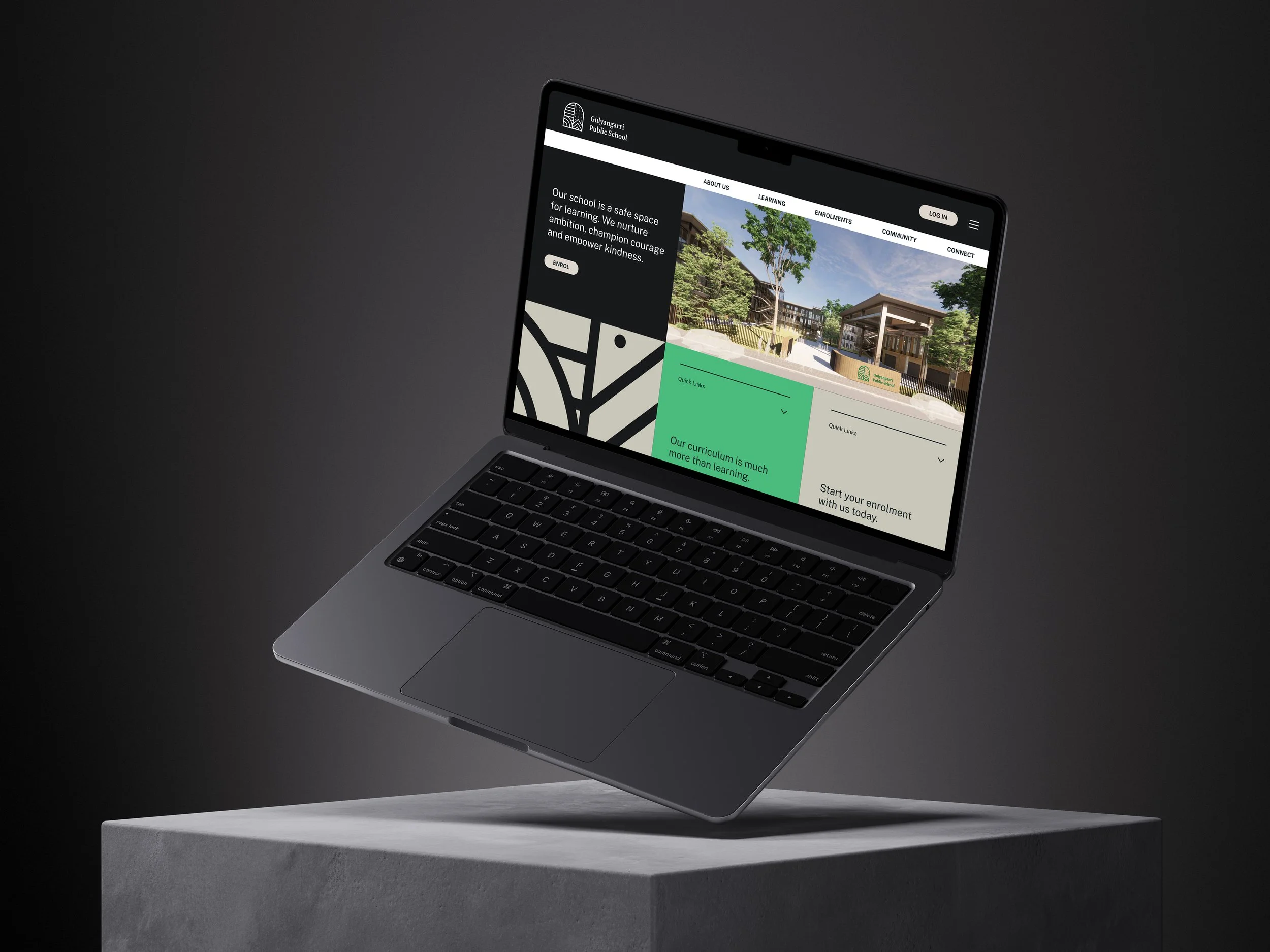
These elements extend beyond the logo, becoming playful patterns and graphic forms across print, digital, uniforms and signage. Grounded in colours drawn from nature, the identity gives a diverse school community something shared to gather around.
Uniform concepts visualised using AI-generated models.