
Etota

Print Design

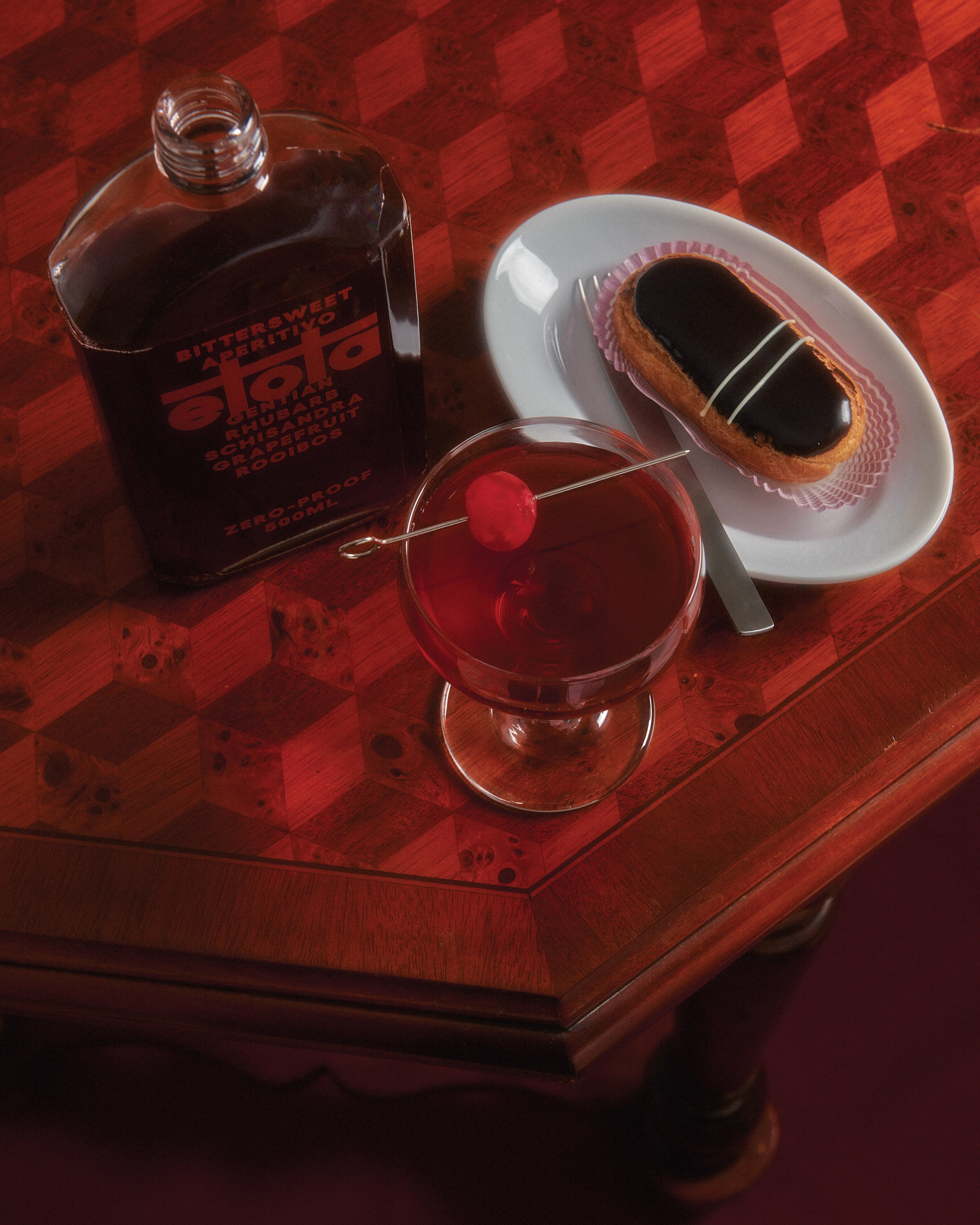
Design development for Etota’s brand communications and assets, shaping a visual language that mirrors the drink’s complexity, craft, and ritual. From packaging to print to system thinking, every detail was crafted to evoke the bold, bittersweet essence of Etota.

Discover more about Etota

An open brochure or flyer promoting Etota, a non-alcoholic aperitivo. The brochure features images of a red-colored drink in a glass, along with text describing the product, its story, profile, flavor, and serving suggestions. The background is a marble surface.
A person's hand reaching down towards a red paper shopping bag on a light-colored textured floor. The bag has the words 'BITTERSWEET' printed on it and the brand name 'aiota' at the bottom.
A set of three photos laid out on a gray textured surface. The first photo shows a restaurant menu next to a glass of red drink, a bottle of alcohol, and a small plate with a pastry. The second photo shows the same items with a water bottle and a tray of small eggs. The third photo focuses more on the water bottle and eggs, with a spoon placed on the tray.
Two business cards on a gray surface. The left card is maroon with red text and logo, saying 'Bittersweet Aperitivo' and 'Zero-Proof'. The right card is white with maroon text, providing contact information for Kate Forrester, Director, with email and phone number, and social media handle.
Black wristbands with red text and logo scattered on a gray textured surface. The wristbands feature the words 'etot', 'BITTERSWEET,' 'APERTIVO,' and the website 'ETOTADRINKS.COM,' along with a logo of a person lifting weights.
A red and black vertical banner for Etiquette, a non-alcoholic bittersweet aperitivo, featuring a pixelated checkered design and a stylized wine glass icon.